You are using an out of date browser. It may not display this or other websites correctly.
You should upgrade or use an alternative browser.
You should upgrade or use an alternative browser.
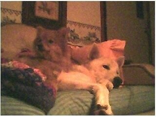
My Babies
- Thread starter crimsontsavo
- Start date
crimsontsavo
Fish Herder
crimsontsavo
Fish Herder
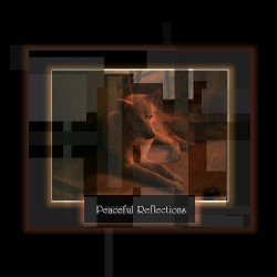
Need an Opinion- the Artsy one- should I print and frame it?
Does it look professional?
Does it look professional?
Adrinal
4k gallons and growing!
Concept is nice... I was drawn first by the vertical line Left of his head... perhaps too bright...? If there is any way to pull that line out I think it would help heaps... should have the dogs face be brightest in the center area IMO...
I'm not an artist though... just a gut reaction.
I'm not an artist though... just a gut reaction.
crimsontsavo
Fish Herder
Coolio- thanks man! 


