🌟 Exclusive Amazon Black Friday Deals 2024 🌟

Don’t miss out on the best deals of the season! Shop now 🎁

Tips for making your aquarium look nice and pop out?

Here's a bit more about the rule of thirds, stolen from a previous post. Hope it makes sense. :)

Think in terms of focal points: Spots that draw the eye. Focal points can be hard structures (rocks or wood structures) or interesting accent plants. For your scape, a particularly interesting piece of wood, an intersection of several, or an interesting rock formation would form a great focal point.

Put a focal point about 1/3 of the way in from the side of the tank around 2/3 the height.

It makes a natural-looking but coherent scape.

scaping 1.png


Something like this, with a wood structure as a primary focus and a really interesting plant (or rock, or pot, or more wood--just anything that sort of draws the eye into the scene) as a secondary focal point. These points get one's attention initially, drawing the viewer's eye into all the other interesting but more subtle plants and such waiting in the background.

scaping 2.png
 
Here's a bit more about the rule of thirds, stolen from a previous post. Hope it makes sense. :)

Think in terms of focal points: Spots that draw the eye. Focal points can be hard structures (rocks or wood structures) or interesting accent plants. For your scape, a particularly interesting piece of wood, an intersection of several, or an interesting rock formation would form a great focal point.

Put a focal point about 1/3 of the way in from the side of the tank around 2/3 the height.

It makes a natural-looking but coherent scape.

scaping 1.png


Something like this, with a wood structure as a primary focus and a really interesting plant (or rock, or pot, or more wood--just anything that sort of draws the eye into the scene) as a secondary focal point. These points get one's attention initially, drawing the viewer's eye into all the other interesting but more subtle plants and such waiting in the background.

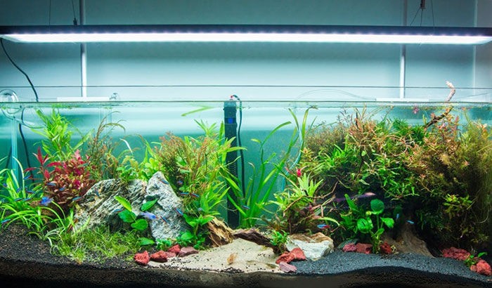
scaping 2.png
This only scratches the composition surface ;)

Composition.png
 
Here's a bit more about the rule of thirds, stolen from a previous post. Hope it makes sense. :)

Think in terms of focal points: Spots that draw the eye. Focal points can be hard structures (rocks or wood structures) or interesting accent plants. For your scape, a particularly interesting piece of wood, an intersection of several, or an interesting rock formation would form a great focal point.

Put a focal point about 1/3 of the way in from the side of the tank around 2/3 the height.

It makes a natural-looking but coherent scape.

scaping 1.png


Something like this, with a wood structure as a primary focus and a really interesting plant (or rock, or pot, or more wood--just anything that sort of draws the eye into the scene) as a secondary focal point. These points get one's attention initially, drawing the viewer's eye into all the other interesting but more subtle plants and such waiting in the background.

scaping 2.png
Do you possibly have a video that would be a good explanation on how it works with the placement and all that?
 
Do you possibly have a video that would be a good explanation on how it works with the placement and all that?
Well, here's a video that kind of shows what I'm talking about, but I'm not sure if this is what you're asking for.
 
Here's a bit more about the rule of thirds, stolen from a previous post. Hope it makes sense. :)

Think in terms of focal points: Spots that draw the eye. Focal points can be hard structures (rocks or wood structures) or interesting accent plants. For your scape, a particularly interesting piece of wood, an intersection of several, or an interesting rock formation would form a great focal point.

Put a focal point about 1/3 of the way in from the side of the tank around 2/3 the height.

It makes a natural-looking but coherent scape.

scaping 1.png


Something like this, with a wood structure as a primary focus and a really interesting plant (or rock, or pot, or more wood--just anything that sort of draws the eye into the scene) as a secondary focal point. These points get one's attention initially, drawing the viewer's eye into all the other interesting but more subtle plants and such waiting in the background.

scaping 2.png
Ohh ok I’m starting to understand I watched some videos on the rule of thirds and I’m starting to get it, this is actually a smart idea for aquascaping
 
I'm not sure if it was noted somewhere in the thread already, but it's interesting to note that sometimes the lack of a thing, or NOthing, can actually comprise 1 of the 1/3's in a "rule of thirds" composition.

Negative space takes up room too!
 
I’m confused on the golden ratio. Like how do I make things in my tank 1:16 I see other people Aquascaping like this but I’m confused on how they know how to make their aquarium golden ratio. Sorry if I’m confusing,
 
I’ve Googled!


That’s my learning for today 🙂

EDIT: To remove the ’copy and paste’ text as I’ve also learnt to insert a link to a website 😂
 
What you want the viewer to focus on... 😉🤩

At some point you may need to think less about it.


Make a list of the rocks and wood...hardscape...whatever you have for decor.
Make a list of plants.
Make a list of fish.

Remember, the fish come first.
Study the list and take into consideration whether there needs to be a space for specific fish types. For example, whether or not any specific fish need more plant cover. Or, do you need to provide a space for a little one to hide and feel secure? Perhaps you need to soften the flow near the filter? Perhaps you need to make sure the flow is unimpeded?

Would you like to obscure the heater or other equipment?

After you address these issues you may have some of the layout decided for you based on your findings ...
 
Also, you don't need to follow all these fancy things. Just kinda do whatever. Experiment until you feel it's right. Some aquarium shops have boxes with substrate in it and rocks around it for you to experiment with the scape until you are satisfied. Just do whatever. Preferably with plants though. And make sure that the fish will be comfortable in the scape, as @vanalisa said
 
Some people just have an instinct for good composition, whether its a photo, a piece of art or an aquascape.
Some don't...and never will.
That said, a lot of work has gone into trying analyse why we like what we like and what makes a pleasing (to many) composition. From this, similarities and patterns were found and from these, we get the Rule of Thirds, for example.

Anyone turning up at an art, photography or aquascaping class, wanting to improve their messy, visually unpleasing images or 'scapes, will be taught the Rule of Thirds to begin with and the rest will usually follow on from there.

It's not something you can just read and then expect to do. You need to be able to understand it and this requires some effort...and practice. It always helps if you have good examples to study, so you can actually see the difference between two versions of the same image, where one is cropped using Rule of Thirds and the other isn't.

Trying to give an example...compare these two images;

DSCN4362.JPG
DSCN4362edit.jpg


The same image, but the second is cropped to take the subjects off-centre. The first is what is usually taken when people 'just take a photo', with no consideration for composition and put the subject bang in the middle.
Sometimes, using Rule of Thirds, an eye is placed at an intersection, of a flash of colour.

DSCN3763.JPG
DSCN4339.JPG


And all of that said, as already implied, what looks good to you is purely subjective to you.
 

Most reactions

Back
Top